Customizing keyboard colors is one of the small details that make chatting more personalized. In FM WhatsApp, this feature is much more than just a simple appearance change. You can adjust the keyboard style to match your theme, or even create a unified visual effect throughout the chat interface, and this is where whatsapp keyboard colour settings become especially useful for users who want a consistent and visually appealing design across the app.
We have shared the ways to change FM WhatsApp icon before. This guide will explain how keyboard colors work, how to change them, and how to make them look simple, comfortable, and suitable for everyday use.
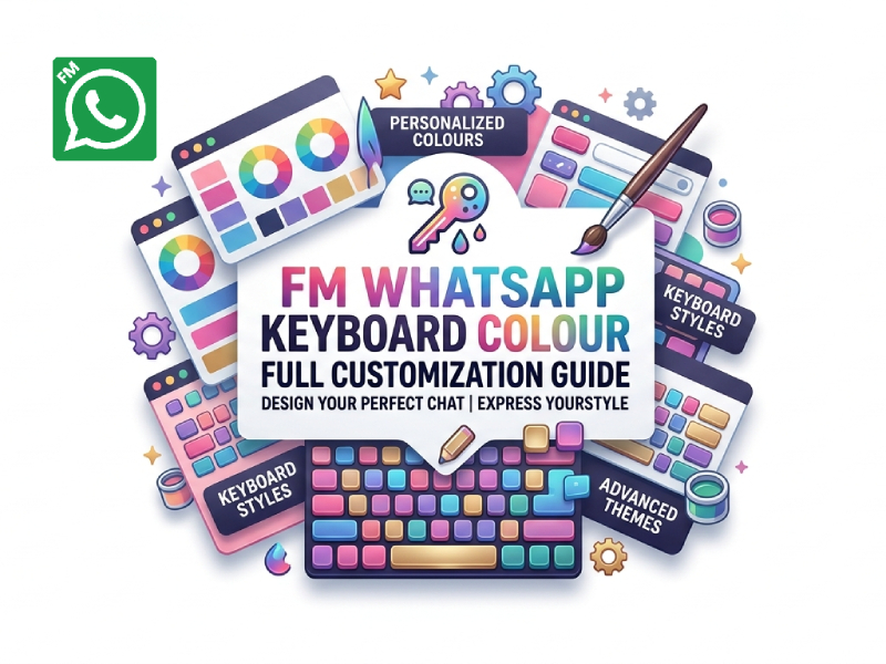
Why Keyboard Colour Matters
Most people may not notice the keyboard at first, but it is actually one of the most frequently used parts of an application. Every message, reply, search, or quick emoji input begins with the keyboard. Therefore, even a slight change in keyboard color can affect the entire chat experience, and this is where a colourful keyboard for whatsapp can subtly reshape how users interact with their chats.
Carefully chosen keyboard colors can make the interface easier to read and use. If the contrast is good, the keys will be clearly visible, making typing feel more natural. On the other hand, if the colors are too similar to the background or too bright, it may cause slight visual fatigue, especially during long conversations.
Keyboard color is also closely related to personal comfort. Some users prefer darker shades because they feel more comfortable for the eyes, while others prefer lighter shades because they feel more refreshing and brighter for the eyes. These preferences are not just about style, and they also influence how long users comfortably stay in an app and avoid fatigue.
In FM WhatsApp, keyboard colors have become an important part of users’ daily chat environment due to its more flexible customization features compared to standard applications. It’s a small detail, but it subtly affects readability, atmosphere, and overall usability every time you type.
Where Keyboard Colour Settings Are Found
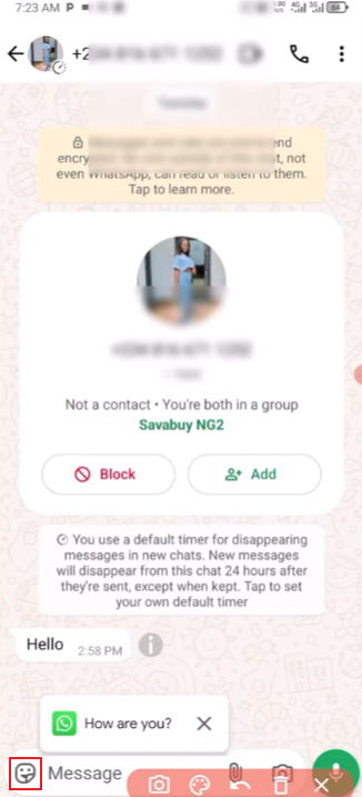
In FM WhatsApp, keyboard settings are usually located in the custom settings section. No complicated steps are required. The path is roughly as follows:
- Open FM WhatsApp
- Go to the main menu
- Open FM Mods / Settings
- Enter Universal Settings or Appearance
- Look for Keyboard Style or Keyboard Colour
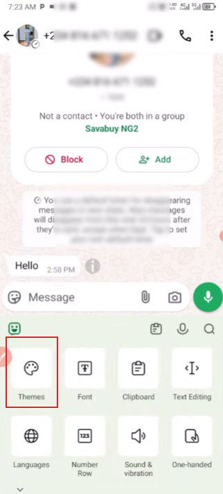
Once inside, you will see options related to themes, background tones, and keyboard design.
How to Change Keyboard Colour Step by Step
After entering the keyboard settings, the process is simple:
1. Select a Base Style
You can choose a basic layout first. Some versions offer light, dark, or mixed styles.
2. Pick a Colour Theme
Choose a colour that matches your chat background. Common choices include:
- Dark grey for a clean look
- Blue tones for a soft interface
- Green-based tones for a classic messaging feel
- Custom colours if supported by your version
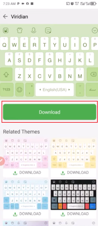
3. Adjust Transparency
Some versions allow control over transparency. This can change how much the chat background is displayed through the keyboard.
4. Apply and Test
After saving changes, open any chat and test typing. This helps you see if the colour feels comfortable.

Matching Keyboard with Chat Themes
Maintaining a consistent visual style between the keyboard and the chat theme will make the entire interface feel more natural and easier to use. Rather than viewing them as separate elements, we should consider them as a holistic visual system. Here are some practical ways to make them match perfectly:
- Keep the same base colour family
If your chat theme is dark, using a dark or muted keyboard usually works better. If your theme is light, a white or soft grey keyboard keeps everything balanced. - Match accent colours with chat bubbles
Many setups in FM WhatsApp allow accent colours. Try to align keyboard highlights with the same colour used for message bubbles or buttons. - Avoid strong contrast clashes
A very bright keyboard on a dark chat screen can feel disconnected. It is better to keep both elements at similar brightness levels so the interface feels smoother. - Use wallpaper tones as a reference
If your chat background uses a wallpaper or image, pick a keyboard colour that matches the dominant tone in that image. This helps everything feel visually tied together. - Keep readability as the priority
Even when matching colours, make sure key labels are easy to read. A good design is not only about style but also about clarity while typing. - Stick to one visual style direction
Choose either soft, minimal tones or stronger, saturated colours, but avoid mixing both. Consistency across keyboard and chat layout makes the experience feel more stable. - Test in real conversations
Open an actual chat and type a few messages. Sometimes a colour looks good in settings but feels different in daily use. Small adjustments often make a big difference.
In FM WhatsApp, the well-designed interface makes messaging feel more natural and fluid, with a better visual experience, without distracting people from the conversation itself.
Using Custom Colours for a Personal Look
FM WhatsApp’s custom color feature gives you more control over the keyboard’s appearance and overall user experience, so you don’t have to stick to a fixed style. Instead of a uniform layout, you can shape the interface in a way that feels more personal and comfortable for daily use, making it less monotonous and more engaging. This level of flexibility is also one reason many users choose to customise whatsapp settings to better match their own visual preferences and usage habits.
One of the main advantages of custom colors is flexibility. You are no longer limited to preset themes, but can choose colors that match the wallpaper, chat bubbles, or even the overall style of your phone. This helps create a more unified visual effect across different parts of the app.
Another advantage is visual comfort. Some users prefer soft shades such as gray, beige, or soft blue because these colors are more eye-friendly. Other users may choose a darker color scheme for a more stable and softer interface. Custom colors allow you to adjust this balance based on comfort during long typing sessions.
Custom colors allow you to easily express yourself. Even without changing the core functionality, the appearance of the keyboard can reflect your mood or preferences. Some users frequently change colors, while others set a style and use it for a long time. Both methods are possible, depending on how you use your phone.
Small Tips for Better Setup
To make your keyboard layout look cleaner and more comfortable for daily use, a few small adjustments can make a big difference. These are simple changes, but they can improve the overall visual effect and user experience.
1. Keep Colour Choices Simple
Try not to use too many bright colors at the same time. A single dominant color usually works better than multiple bright colors. Soft colors can also help reduce visual fatigue during long conversations.
2. Match Keyboard with Chat Background
A balanced setup usually stems from matching the keyboard to the chat topic. For example, a dark chat background pairs well with a dark keyboard, while a light theme is better suited to soft white or gray tones.
3. Focus on Readability First
No matter how beautiful the color is, the lettering on the buttons should be clear and legible. Make sure to check that the letters and symbols are clearly visible. If you notice anything unclear, please adjust the contrast or brightness slightly.
4. Avoid Over-Decorating
Additional effects, gradients, or complex designs can sometimes make a keyboard look cluttered. A simpler layout usually feels more natural and easier to use.
5. Test in Real Chat Use
Before making the final settings, try typing text in different chat windows. This helps you see how the keyboard looks against light and dark backgrounds, not just in the settings menu.
6. Stick to One Style Over Time
Changing styles too often can make the interface feel inconsistent. Once you find a comfortable setup, keeping it stable usually gives a better long-term experience.
Final Thoughts
Customizing the keyboard in FM WhatsApp is a small but useful feature that can make your chat experience more personalized. It won’t change how you chat, but the app will give you a different feeling every time you type.
By choosing the right colors and keeping things simple, you can create a clean and comfortable input space that perfectly matches your style.